There are many instances where a user will want to have a custom home page as each group that uses Katmandoo will most likely be using different function of it while giving it a more personal touch.
NOTE:
To make quick edits to the home page follow these steps.
Download the file below.
Make changes to the text and cards.
Save the file
Move the file to the custom folder and override the home.html file that is already there
NOTE: Having basic knowledge of HTML will make this much easier, but it is not impossible to follow without
A blank start
Within the custom folder there should be a file called home.HTML. If everything in this file is removed then the home page is reverted to its absolute default.

In HTML everything is split into a tag based system where everything (in reality it is not actually everything, but for this guide it may as well be) is split into these tags, all with a beginning tag and an ending tag. All beginning tags sit between the Less than and greater than symbols like this:
<p>
All ending tags are very similar, but with the exception of a forward slash, this indicates to HTML that the tag has “closed”
</p>
In HTML there are lots of tags, all with different meanings, but for working within this help page there are really only a few that need to be known.
| Element | Meaning and use |
| <div> | A division element. This is the “bread and butter” for editing the Katmandoo Home page. Theses elements are like a virtual ‘block’. If something needs to be separate from something else it should be withing a different “div” |
| <hX> | This element is special, it is the Header element, usually reserved for titles of varying importance. Replacing the ‘X’ in the left with a number from 1-6 will make what ever is inside this tag a big bold header with varying size (based on the number, where 1 is the biggest and 6 is the smallest) |
| <a> | The “a” tag is also another special element. Standing for ‘anchor’ this tag is a link to somewhere else. When used correctly this tag can be setup to be a clickable link, taking the user to a different page. |
| <p> | The “p” tag is a paragraph element and any text that is in a paragraph should be put inside one of these tags |
| <span> | “Span” is an element that doesn’t mean anything and this tag is a generic “all-use” tag, so it can be used if there is uncertainty of which tag to use, or is something specific isn’t required. |
Here are some examples of various different ways that the home page could be customised.
(Please note that the “styles” seen here are not covered in this guide)
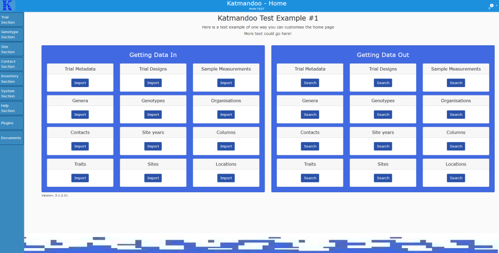
Home Page Example 1
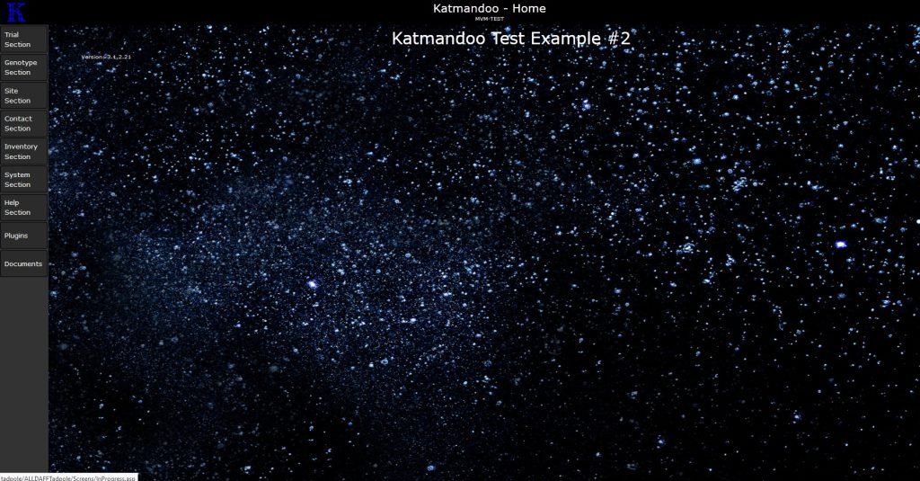
Home Page Example 2
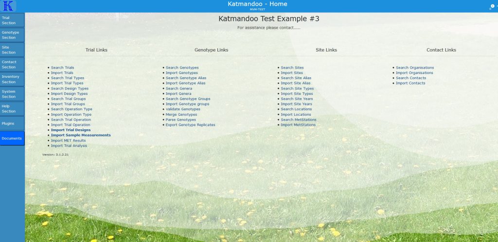
Home Page Example 3
Element Attributes
Element attributes are extras that go inside the beginning tag for an element, and they can have a great effect on what that tag does.
While there is an incredibly large amount of element attributes available for HTML, this guide will only cover three, as that is all that is really needed for customising the home page
Classes
A class is like a grouping for HTML elements that can have styles or functionality applied to. As an example a class could be created called “Red-Text”. Then underneath the style (CSS) could be set to modify all elements that have “Red-Text” and give them a red text colour.
Note: When using multiple classes they are separated by a space, so no classes may have a space in their name (Underscores and dashes are ok)
A more advanced example following the same principle is that a tag could be created called “Not-In-Use” and underneath in the code (Javascript) it could be set to display a message whenever an element with “Not-In-Use” is clicked.
With the class attribute there is no limit to how many classes an element could have, so with the above two examples a <p> element could be created with the text inside “Under construction” and it could have the attribute: “class = ‘Red-Text Not-In-Use’”
This would make the text red and tell a user when clicking on it that it is not in use.
Hypertext Reference (href)
For this guide a href would only be used as an attribute for an “<a>” tag and it really only has one use.
A href is specified for a link as being the location the link will take the user.
So for an example:
<a href=”www.google.com”> This link goes to Google </a>
This will create a link for the text “This link goes to Google” and that link will take the user that clicks it to
Note: To link to a Katmandoo page the best method to use is:
<a href=”./Trial/Index> Link To Trial </a>
(Where the hompage is replaced with “./”)
Ids
The concept of Id’s is covered more in the guide on how to customise the login page but in general an Id is a unique identifier that is very similar to a class.
They main key difference is that there can only be one Id per page.
Example:
<p id=”First_Paragraph” class=”Red-Text”> This is a test paragraph </p>
<p id=”Second_Paragraph” class=”Red-Text”> This is a Second paragraph </p>
The default Home page and Bootstrap
Katmandoo version 3 uses a common third party web system called bootstrap to assist with styling and consistency within all its webpages. This system allows everything to be split into a grid based system of columns and rows for easy readability.
First everything is split into rows. These rows can be any height or any width and they can contain at most 12 columns.
Now the columns widths must always equal 12, otherwise they overflow and things start looking really bad (they can be under 12 but it may also look odd).
A column can have any number of rows and each row can have 12 more columns in it, this repeats forever but would obviously look pretty bad a few loops in.

The way that bootstrap is constructed is by using an extensive library of predefined classes
(So if a custom class is not doing what is it expected check it is not already a Bootstrap class) [Link to Bootstrap]
Now for understanding the default homepage it will be broken down in sections. Since HTML works from top to bottom the first thing about the home page, that isn’t the nav bar or sidebar is:

So this means that the first chunk of code will match this
<div class=”row mt-2″>
<h3 class=”w-100″>
Katmandoo
</h3>
<p class=”w-100″>
Welcome to the Katmandoo interface. Commonly used areas are accessible from this home page with additional areas accessible using the sidebar links.<br /> This page can be customised to suit the needs or your group by editing the Home.html file in the Custom folder.
</p>
</div>
Breaking this down.
First the code starts with a “div” as this section of text is a separate block from the rest of the text on the page. But this div as two classes;
– row
– mt-2
Both of these are Bootstrap classes, row tells the system that everything in this div exists as a row on the page (imagining a set of columns an rows to split content). Basically this will keep it separated from the next div that has row in a neat way.
The second class, “mt-2” is a Bootstrap class used for spacing (more information can be found here), but simple it is saying to put a margin (m) at the top (t) of this element (with a value of 2)
Next there is the heading element, h3. The number 3 is chosen here as a nice level between the huge size of h1 and the small size of h1. It also contains a bootstrap class.
– w-100
This class is used for specifying the width of the element in percent, meaning the width of this h3 element is 100% of the element it is inside (the div specified above)
So if this was set to w-50 the heading would be 50% the width of the div.

The bottom image is the default, with the title sitting at the center of 100% of the page width
Next there is the paragraph element. There is nothing new here as it has the same class, the only thing of note is the strange element in the text <br />.
This is a special element that doesn’t have a begging or end tag (they are combined), instead it is just used to signify a line break.
The cards
The whole document is rather long, though most of it is repeating and it is mostly populated with “cards’.
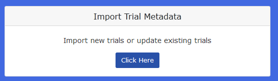
The default home page is littered with Bootstrap cards, these are made of several segments.
First is a containing div to specify there will be a card with the class; “card”
Then an inner heading element of size h5 with the class “card-header” to specific it is the title of the card
Then there is another containing div to specify that everything inside with the class “card-body”
Lastly there is the contents of the card body, a paragraph tag with the class; “card-text” and then the actual text inside.
And there is an anchor (link) tag, containing the href to the link location and there are two special bootstrap tags;
– btn
– btn-primary
Both of these tags are related to the visual button that can be seen saying “click here”. But being more specific, “btn” styles that anchor tag to look like a button and “btn-primary” sets the colour scheme to be the primary colour scheme.
Quick Templates
Feel free to download and use an of these templates for customising the home page.
Template 2
This is the template used in the third example near the top of the page